You found the perfect amigurumi pattern, you have your hook, and then you freeze in front of the yarn wall: which colors do I actually choose? Color is the single fastest way to make a plush look professional — or accidentally muddy and off. The good news is you don’t need an art degree. You need a handful of simple, repeatable rules that translate classic color theory into the language of yarn.
In this guide you’ll learn how to build amigurumi color palettes step by step: how to use the color wheel without overthinking it, how to keep your palette to the right number of colors, which combinations read as “cute,” and how to choose colors that look great in real life and in photos. By the end you’ll be able to walk up to any yarn shelf and choose with confidence.
What you’ll learn

Color Theory for Yarn, Without the Jargon
The color wheel looks intimidating, but for amigurumi you really only need three friendly schemes:
- Analogous — colors that sit next to each other (teal + green + blue). Calm, harmonious, hard to get wrong.
- Complementary — colors opposite each other (coral + teal, mustard + violet). High contrast and eye-catching; use one as the star and one as the accent.
- Monochromatic — one color in light, medium and dark tones plus cream. The safest, most “intentional” look for beginners.
That’s it. Ninety percent of adorable plushies live inside those three schemes. When in doubt, start analogous or monochromatic — they almost never fail.

How Many Colors Should an Amigurumi Have?
More colors is not more cute — it’s usually more chaos and more loose ends. A clean amigurumi almost always follows a simple structure:
- 1 main color for the body (roughly 60% of the plush).
- 1–2 accent colors for ears, belly, cheeks or clothing (about 30%).
- 1 detail color — usually black or dark brown — for eyes and nose (about 10%).
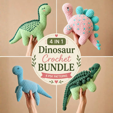
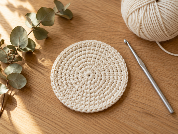
This is the classic 60-30-10 balance, borrowed from interior design. Keep beginners to 2–3 colors total; once you’re comfortable joining yarn cleanly, you can add a fourth. The monochromatic set shown here uses a single blue-teal family plus cream, and it still reads as a coordinated, professional collection.

Best Yarn for Amigurumi: The Complete Guide
Pick the right fiber, weight and texture so your color choices actually shine in the finished plush.
Explore the yarn guide →Cute Color Combinations That Always Work
If you just want combinations you can copy today, here are palettes that consistently look adorable on plush toys — grouped by mood:
| Mood | Main | Accent | Detail |
|---|---|---|---|
| Soft & sweet | Dusty pink | Cream | Chocolate brown |
| Fresh & modern | Sage green | Mustard | Off-white |
| Calm & cozy | Soft teal | Coral | Black |
| Playful pop | Lavender | Pale yellow | Deep purple |
| Gender-neutral gift | Oatmeal cream | Terracotta | Dark grey |
Notice the pattern: one soft main color, one gentle contrast, one grounding detail. None of these fight each other, and every one of them is beginner-friendly. Save this table as your cheat sheet the next time you’re standing at the yarn wall.
Realistic vs. Fantasy Palettes
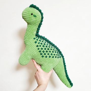
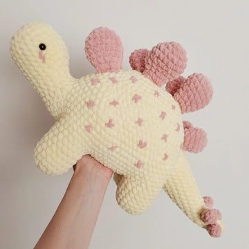
One of the biggest color decisions is whether you want your creature to look realistic or fantasy. Both are valid, and they attract different audiences. Realistic palettes — a brown bear, a grey elephant, a spotted cow — feel timeless and giftable, and they’re the safe choice for collectors and older recipients. Fantasy palettes — a lavender dinosaur, a mint-and-pink cat, a rainbow octopus — feel modern, playful and highly “shareable,” which is exactly why they dominate trend-driven shops and social feeds.
A smart approach is to design the same pattern twice: once in a realistic colorway for classic buyers, and once in a soft-pastel fantasy colorway for the trend crowd. Because color never changes the pattern math, you get two very different products from a single design with zero extra pattern work — only a swap of yarn.
Building a Seasonal Palette
Seasonal colors are an easy shortcut to a palette that feels current, especially if you sell at markets or online. Lean into the mood of each season:
- Spring: pale mint, buttercup yellow, dusty pink, soft lilac — fresh and light.
- Summer: coral, turquoise, sunny yellow, watermelon pink — bright but not neon.
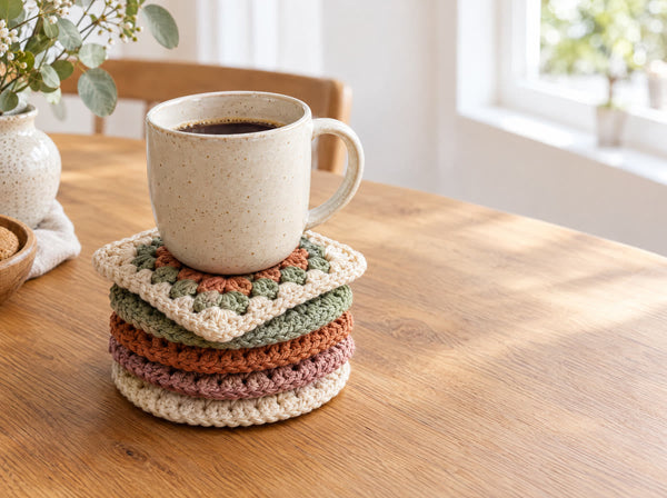
- Autumn: mustard, terracotta, sage, warm cream — cozy and earthy.
- Winter: deep teal, berry red, charcoal, icy white — rich and warm.
You don’t need to reinvent your whole palette each season — just swap the main color and keep your neutral and detail colors consistent so your shop still looks cohesive.

Choosing Colors That Photograph & Sell
If you sell your makes or share them online, color is a marketing decision, not just an aesthetic one. A few field-tested tips:
- Test the pair in daylight before you commit — hold both balls side by side near a window. Screen colors lie.
- Avoid neon main colors; they blow out and lose detail under bright light.
- Give the eye a rest with cream or a neutral so the plush pops against the background.
- One bright accent beats three loud colors for thumbnail clicks.
The simplest sales-safe formula: a soft, warm main color, a neutral, and one confident accent. It looks intentional in person and irresistible in a photo.
Ready to crochet your palette?
Browse beginner-friendly no-sew amigurumi patterns and put your new color skills to work.
Shop MCW Patterns →Common Amigurumi Color Mistakes (And Easy Fixes)
1. Too many equally-bright colors
When every color is loud and mid-saturated, they compete and the plush looks busy. Fix: demote all but one to softer tones, or add cream as breathing room.
2. No value contrast
Two colors that are equally light or equally dark blur together. Fix: pair a clearly light shade with a clearly dark one so features read from across the room.
3. Mixing yarn weights across colors
A thicker accent yarn makes one body part look bulky and off-scale. Fix: match yarn weight (and ideally brand) for every color in the same plush.
4. Forgetting the face
Beautiful body colors fall flat with weak eyes. Fix: keep eyes and nose in strong black or deep brown for a friendly, high-contrast face.

How to Change Colors in Crochet
Once you've planned your palette, learn the clean, invisible way to switch yarn colors mid-project.
Learn clean color changes →Your Simple 4-Step Color Workflow
- Pick a mood — playful, calm, sweet, or gender-neutral. This narrows everything.
- Choose a scheme — monochromatic or analogous if unsure; complementary for a bold statement.
- Apply 60-30-10 — one main, one accent, one detail. Add value contrast.
- Daylight test — hold the yarn together by a window before you buy or start.
Follow those four steps and you’ll build a palette that looks intentional every single time — no art degree required.
Warm vs. Cool: Setting the Mood First
Before you touch the color wheel, decide the temperature of your plush. Warm colors — red, coral, peach, mustard — feel energetic, friendly and cozy; they’re perfect for cheerful characters and holiday makes. Cool colors — blue, teal, lavender, mint — feel calm, gentle and soothing, which makes them ideal for nursery gifts and “sleepy” characters.
You can absolutely mix warm and cool for contrast — a coral scarf on a teal bunny is a classic complementary pop — but decide which temperature leads. When one temperature clearly dominates and the other appears only as a small accent, the palette feels deliberate instead of confused. If a combination ever looks “off” and you can’t say why, it’s often because warm and cool are fighting for equal space.
How Yarn Texture Changes Color
Color doesn’t exist in a vacuum — the yarn itself changes how a color reads. The same “dusty pink” looks very different in matte cotton versus shiny acrylic versus fuzzy chenille. Matte cotton keeps colors crisp and true, which is why it’s the amigurumi favorite. Shiny fibers reflect light and can wash a color out under bright photography lights. Fuzzy or faux-fur yarns blur and soften a color, so a bold shade becomes gentler and a pale shade can almost disappear.
The practical takeaway: choose your fiber and your color together, not separately. If you fell in love with a palette in cotton, don’t assume it will look identical in a fluffy yarn — test a small swatch first. Matching both weight and finish across your colors keeps the whole plush looking like one intentional piece.
Frequently Asked Questions
How many colors should an amigurumi have?
For a clean, professional look, keep most amigurumi to 2–4 colors: one main body color, one or two accent colors, plus black or dark brown for eyes and details. Beginners are happiest with 2–3 colors, because fewer color changes mean fewer loose ends and a tidier finish.
What colors go well together for cute amigurumi?
Soft, slightly muted ‘candy’ tones almost always read as cute: dusty pink with cream, sage green with mustard, soft teal with coral, or lavender with pale yellow. Pair one soft color with a gentle contrast rather than two loud, saturated colors fighting each other.
Should amigurumi be realistic colors or fantasy colors?
Both work. Realistic colors (brown bear, grey elephant) feel classic and giftable. Fantasy colors (pastel dinosaurs, rainbow cats) feel playful and modern, and they photograph beautifully for shops. Choose based on who the plush is for — realistic for collectors, fantasy for trend-driven sales.
What is the 60-30-10 rule in amigurumi color?
It is a simple balance guide borrowed from interior design: about 60% of the plush is your dominant color, 30% is a secondary color, and 10% is a small accent. Applied to a bunny that’s roughly 60% body color, 30% ears/belly, and 10% nose or bow — it keeps the design balanced instead of chaotic.
How do I choose colors that photograph well for selling?
Pick colors with clear contrast against a neutral background, avoid neon shades that blow out under bright light, and keep the palette limited so the eye lands on the plush, not competing colors. Soft, warm tones with one bright accent tend to get the most clicks.
Do I need to buy all yarn in the same brand for one project?
Ideally yes for the main colors, because different brands vary in thickness and sheen even at the same weight, which can make one body part look bulkier. If you mix brands, match yarn weight carefully and hold strands side by side in daylight before committing.
What color should amigurumi eyes and noses be?
Black or very dark brown is the safe, expressive default for eyes and noses because it gives strong contrast and a friendly face. For softer, sleepier characters, a dark grey or deep chocolate can look gentler than pure black.
How do I stop my color combination from looking muddy?
Muddiness usually comes from too many mid-tone, equally-saturated colors. Fix it by adding contrast in value — pair a light color with a noticeably darker one — and by letting cream, white, or a neutral do the ‘breathing room’ between busier shades.
Can I change my mind about colors halfway through a pattern?
Yes, as long as you swap a color for another of the same yarn weight, your stitch count and sizing stay identical. Changing color never changes the pattern math — only the look — so you can freely re-skin a design in your own palette.
Are gender-neutral amigurumi colors a good idea?
Very much so, especially for baby gifts and shop bestsellers. Sage green, mustard, terracotta, soft teal, oatmeal cream and dusty blue all read as warm and gender-neutral, which widens your audience and makes the plush easier to gift.
How do warm and cool colors change the mood of a plush?
Warm colors (red, coral, mustard, peach) feel energetic, cozy and friendly. Cool colors (blue, teal, lavender, mint) feel calm, gentle and soothing. Deciding on a mood first — playful vs. calming — makes the whole palette easier to choose.
What’s the easiest color scheme for a total beginner?
A monochromatic scheme: pick one color you love, then use a lighter and darker version of it plus cream. It’s almost impossible to get wrong, it always looks intentional, and it lets you focus on your stitches instead of on color theory.
This guide is part of the MCW Learning Hub. Happy hooking — and happy color mixing! 🧶🎨